Skills
UX / UI Design, Graphic Design, Copywriting
Challenge
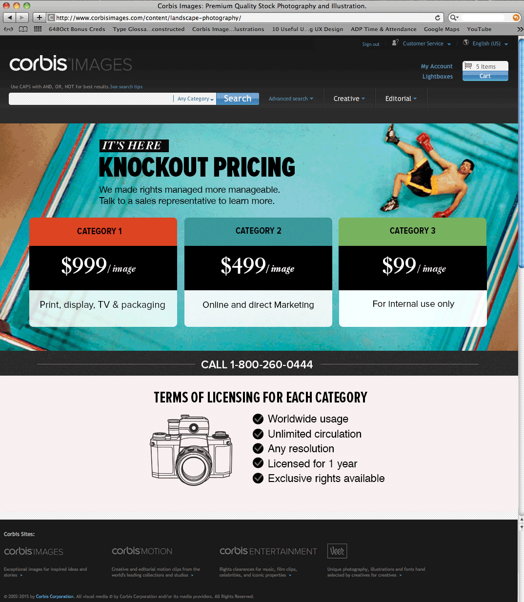
The creative team couldn’t focus on client-facing work because a considerable amount of their time was spent sending updated style guides, logos, approved images etc. to the marketing and developer teams.
User Overview- “Give us the tools”
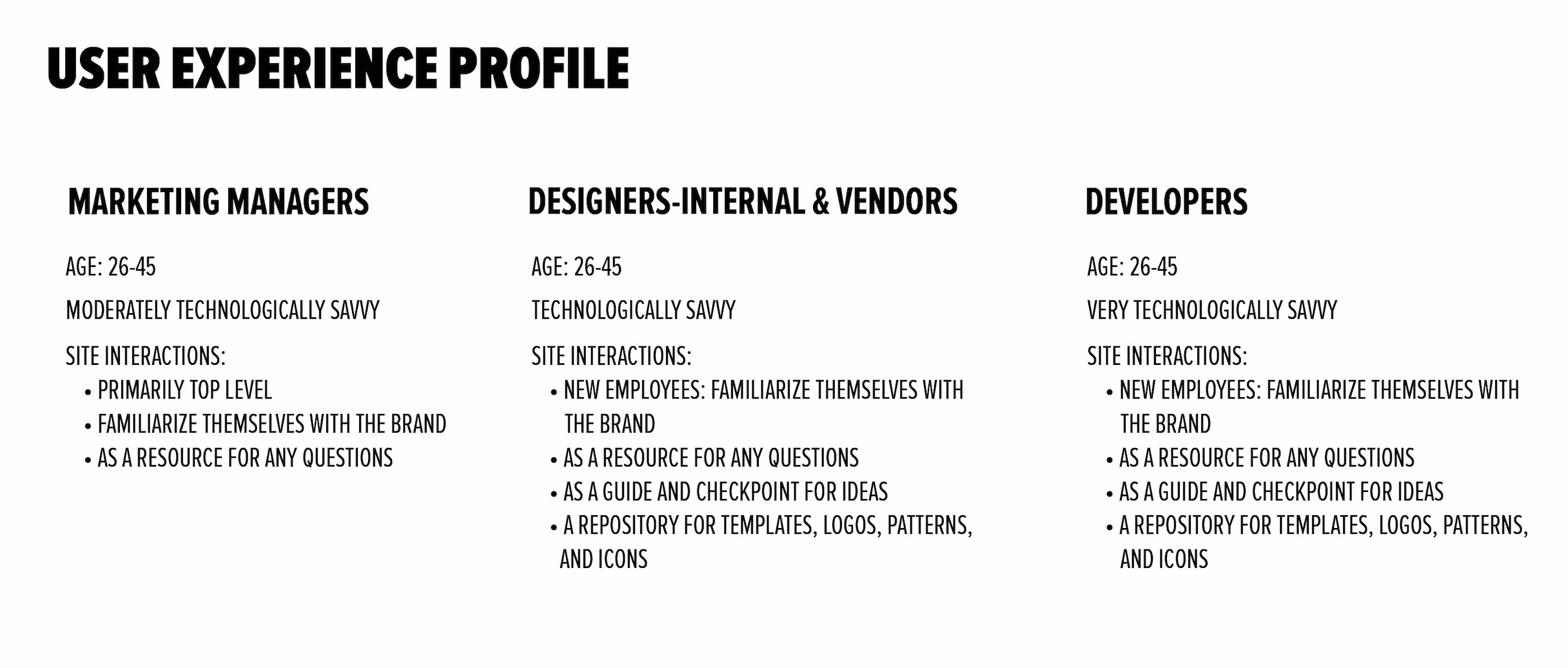
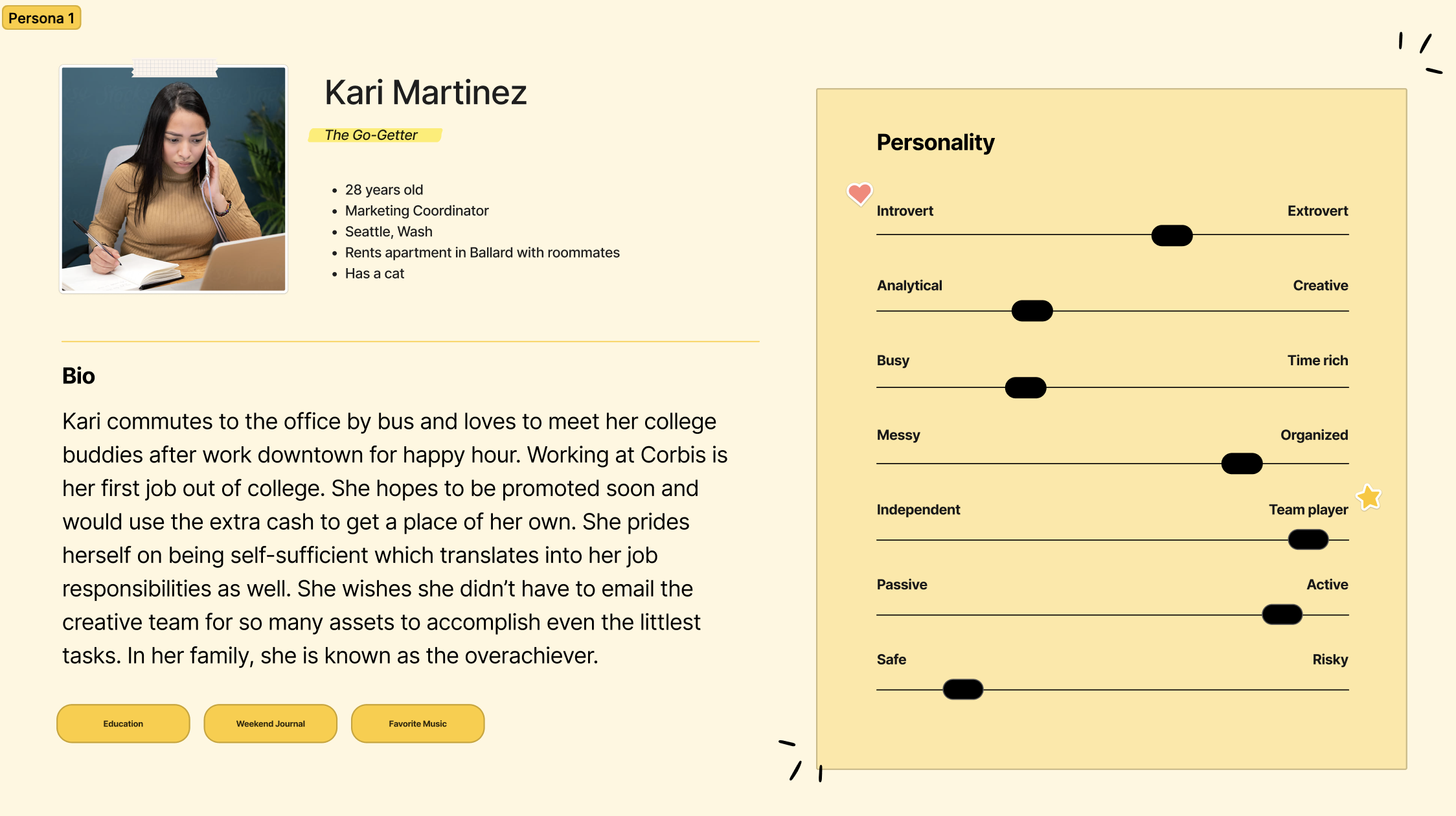
I interviewed marketing managers, developers, project managers, and creatives to get an idea of their pain points. After that, I synthesized the data and created personas and a site map that I could iterate on.
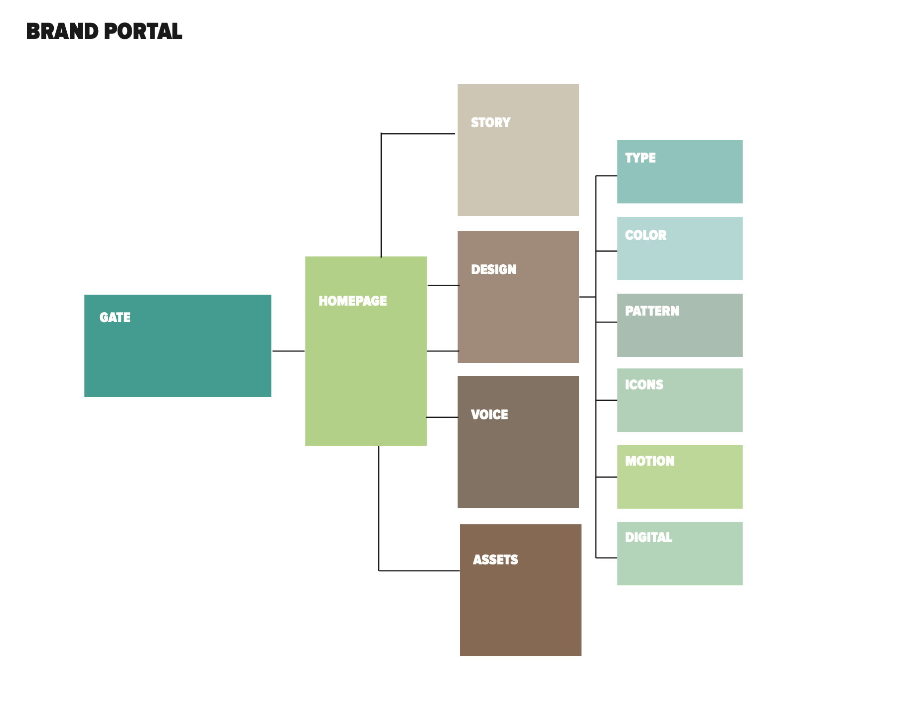
A Site Map and a Features Priority List to Stay in Scope
I designed user flows that addressed the Personas’ tasks at hand that they wanted to accomplish. I developed a feature prioritization list (because everyone wants to add something!) The site map tells which pages flow to the next and also helps me develop a set of templates. At this stage, I began to work with the developer to create page templates that had clear designation of H1, H2, H3 fonts and image placement. By doing this, I didn’t have to design every page because the developer knew what template guide to follow.
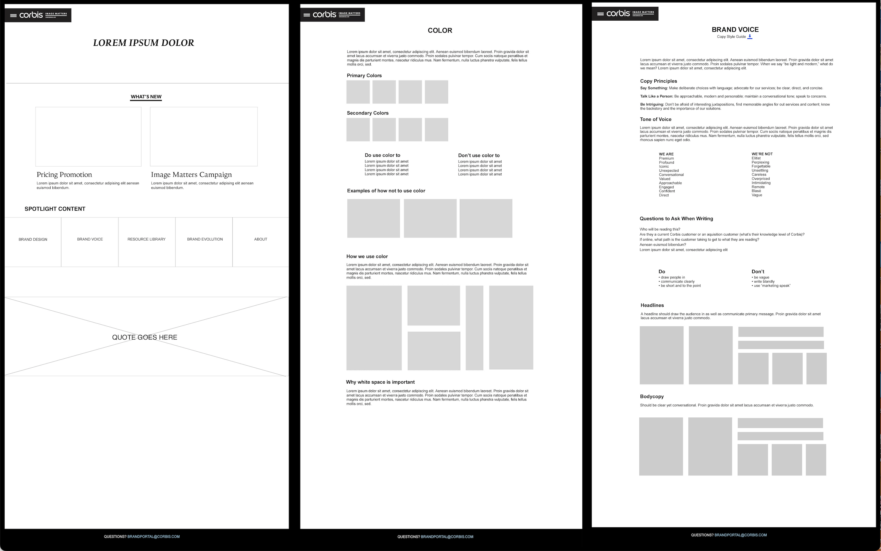
Design System & Templated Wireframes
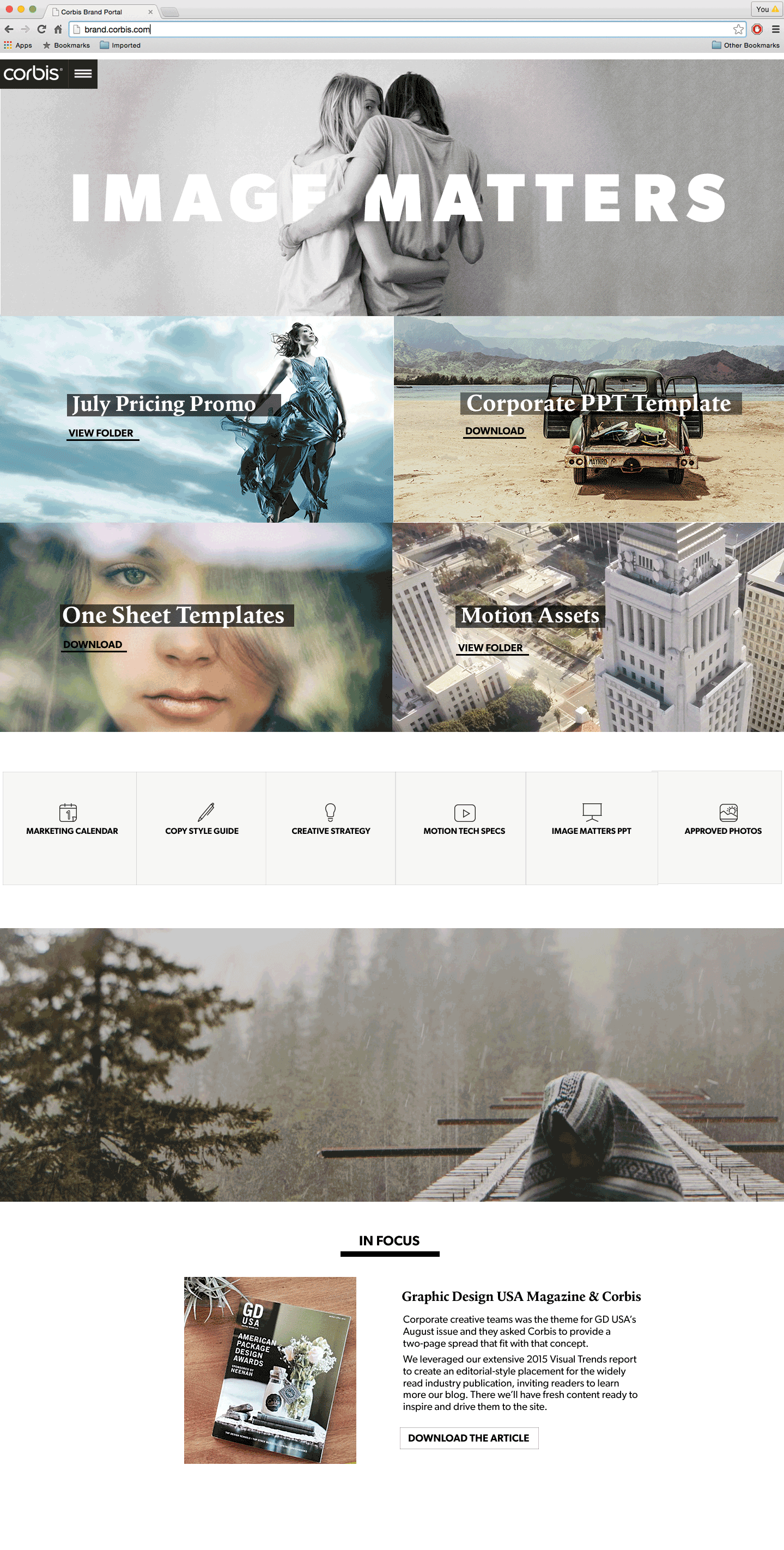
Below is a sample of the wireframes I created for the site. The first is the homepage and two secondary pages. By designing a few of these pages, the stakeholders could get an idea of the function of the site. I could then prototype out some of the wireframes to ensure an intuitive experience.
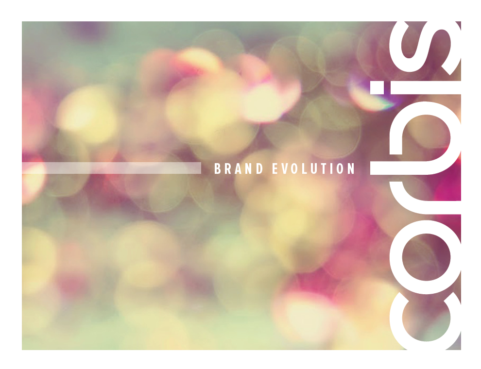
More on Design Systems
Evolving a brand takes time, creativity and tenacity. For this brand, the images were the stars so what sort of design standards could I come up with that showcased the product in all its glory? Take a look . . .
I created a sampling of upper level pages and UI kit in order to save time and money so the developer could code stylized pages that would automatically populate. The design aesthetic of the pages is clean, fresh, and contemporary.
The result: an essential brand standards portal that took minimal amount of time to update and had maximum productivity benefit for the entire company.