Skills
UX Research, UX Design
Challenge
A client came to me with the idea to create an app that let people know when the weather was changing from rain to sunshine. The target user was a stay at home parent who used the app to plan their day and outings with their kids.
Process
To get a feel of who would be using the app, I interviewed 6 stay-at-home parents (dads and moms). Here are some quotes from the data I synthesized:
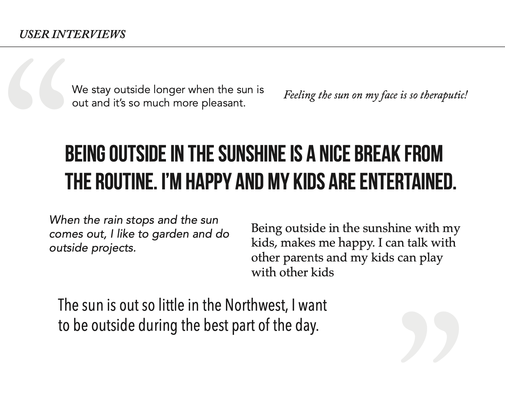
Sun’s Out – When, Where, and Confidence Level
Next I put pen to paper and did some brainstorming about who would be using the app and how they would interact with it.
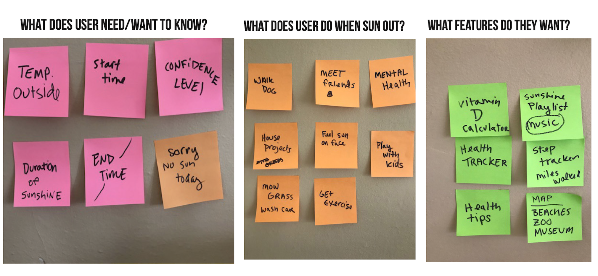
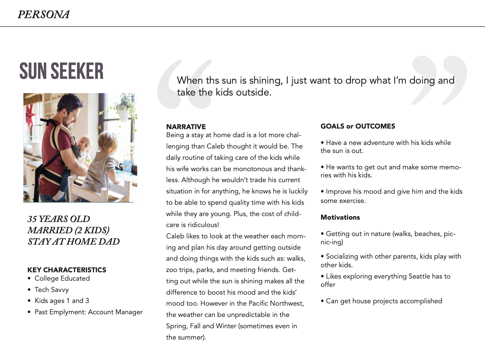
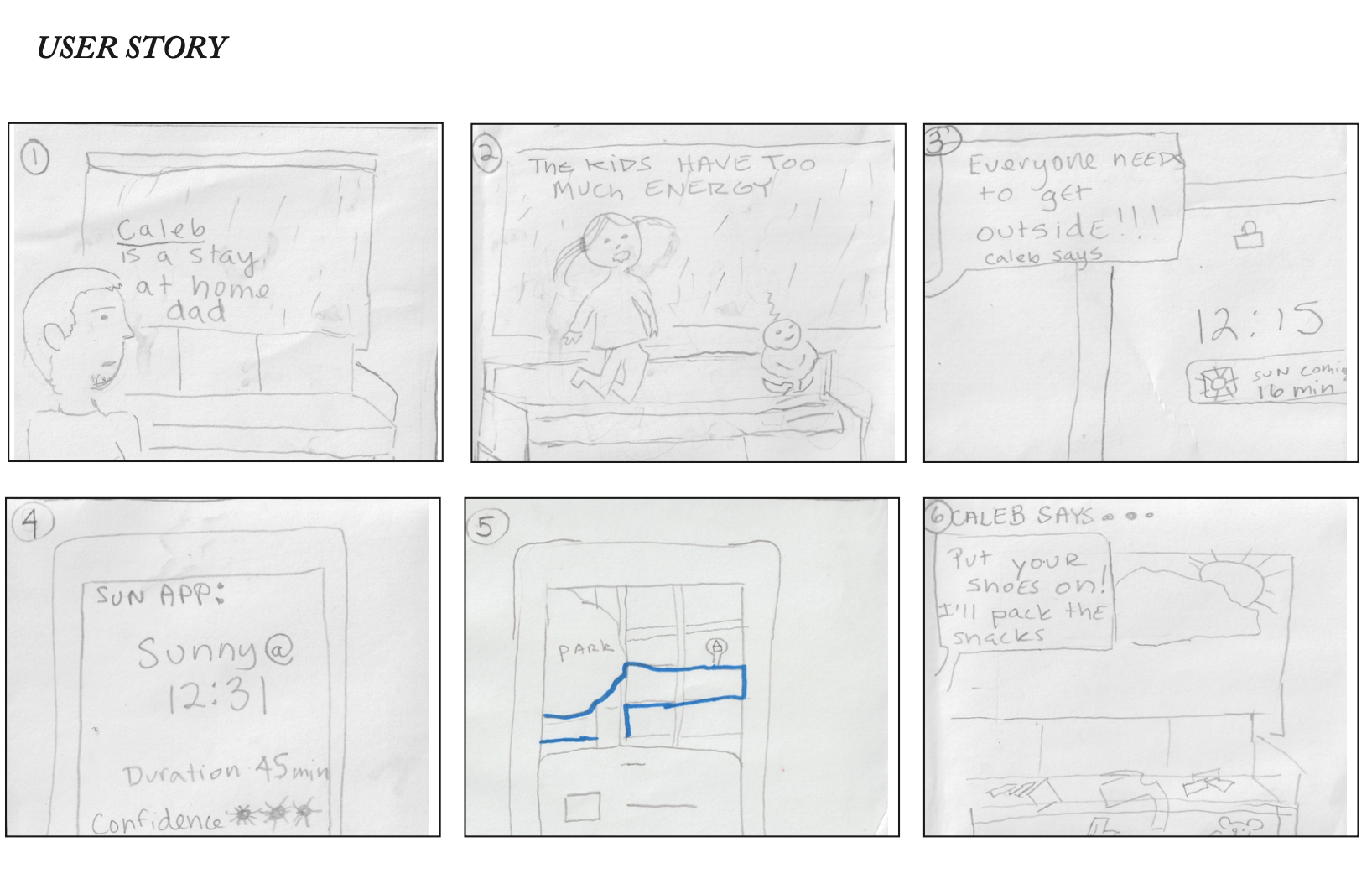
In order to better visualize who I was building the app for, I created a persona and also a user story that showed how this person would interact with the app.

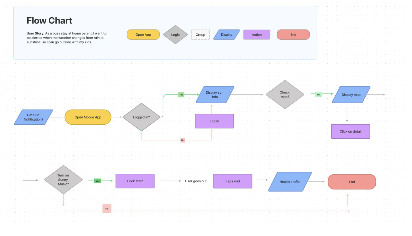
Next I created a user flow that took in to consideration the person’s thoughts, feelings, and goals to make sure that each action was addressed and met within the context of the journey.
Comps
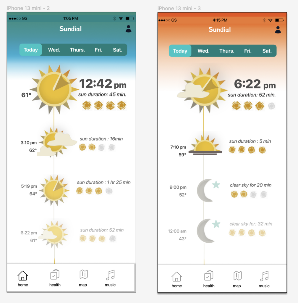
Finally, I took these findings and came up with a concept that centered around a sundial. People used sundials as clocks to tell time. What if I created a modern sundial?
Sun time = Fun time
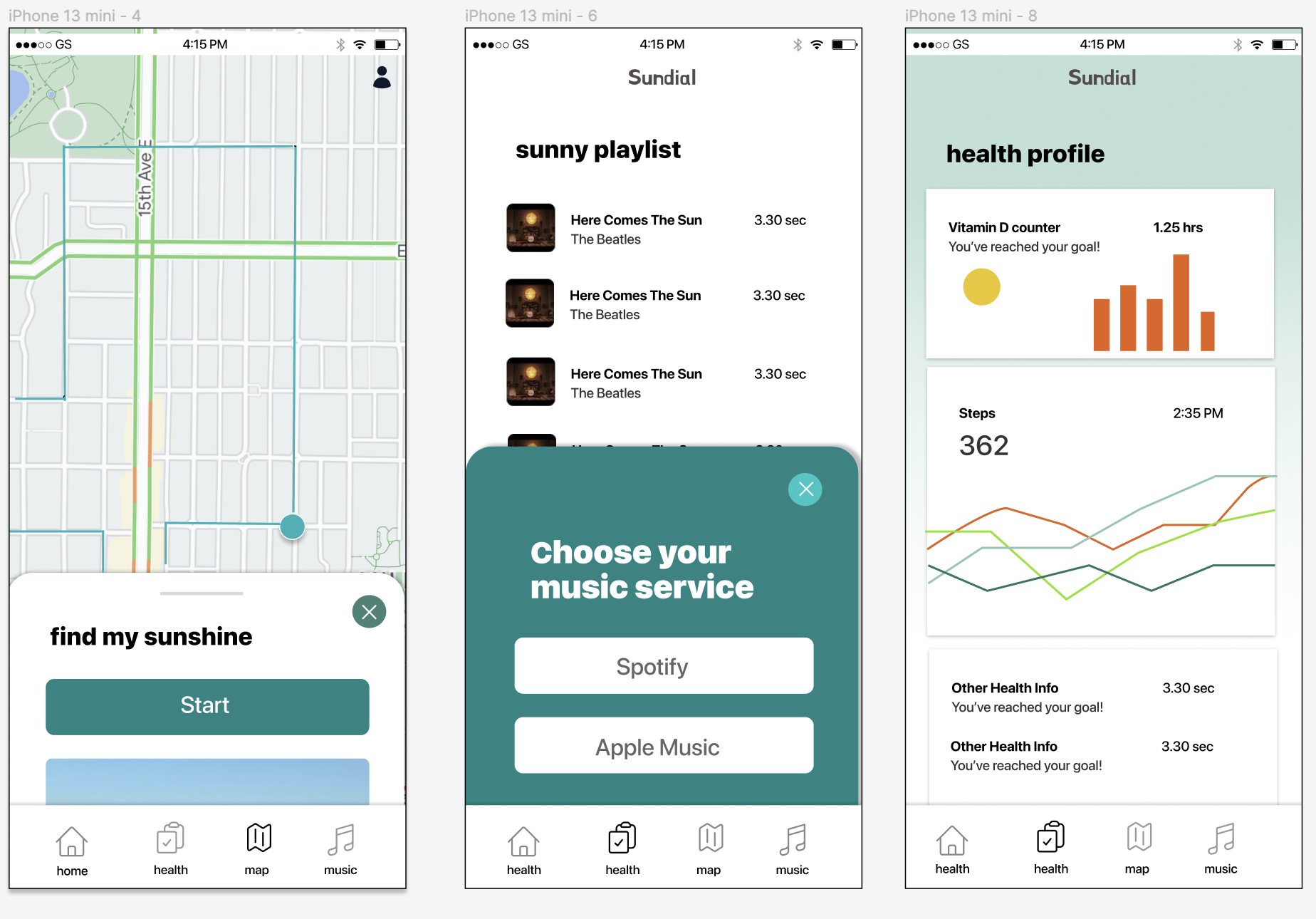
For these comps the user gets an alert on their mobile device and that prompts them to go to the website where they can view the best chances for sun breaks throughout the day. The user can scroll up or down to see the forecast. The app also tells them how long the sun is going to be out for. The small suns show the confidence level in these predictions. The color palette is based on the sky during the day and sunrise /sunset.
