Role
Lead Graphic Designer
Project
Rite in the Rain is a 100 year old company that makes waterproof paper. It has a diverse audience from nature enthusiasts to military personnel. The current mobile site is a single column, and clunky product-exploration experience with a time-consuming checkout.
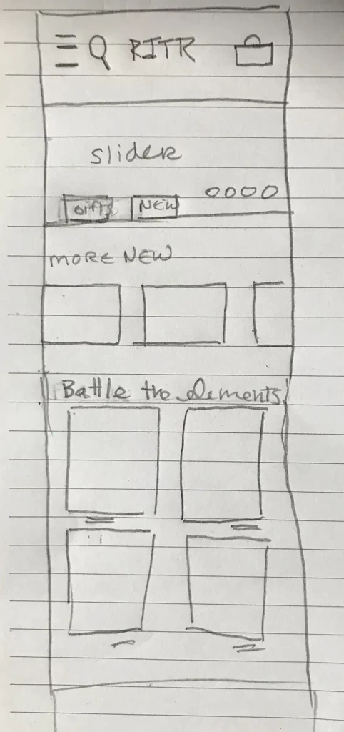
I created a grid for multiple channel exploration. Instead of the site serving up content to the user, with this new site layout, the user could discover and find what they were looking for.
Two Column Grid, Horizontal Scroll, Promo Code Up Front
Google analytics shows that 73% of customers visit RiteintheRain.com on a mobile device and that most customers just purchase 1 item. By creating pages that show categories of products and adding free shipping progress bars, conversion will go up. Also, streamlining the checkout process by combining steps on a single page will make checkout more efficient. The below site is now under development!
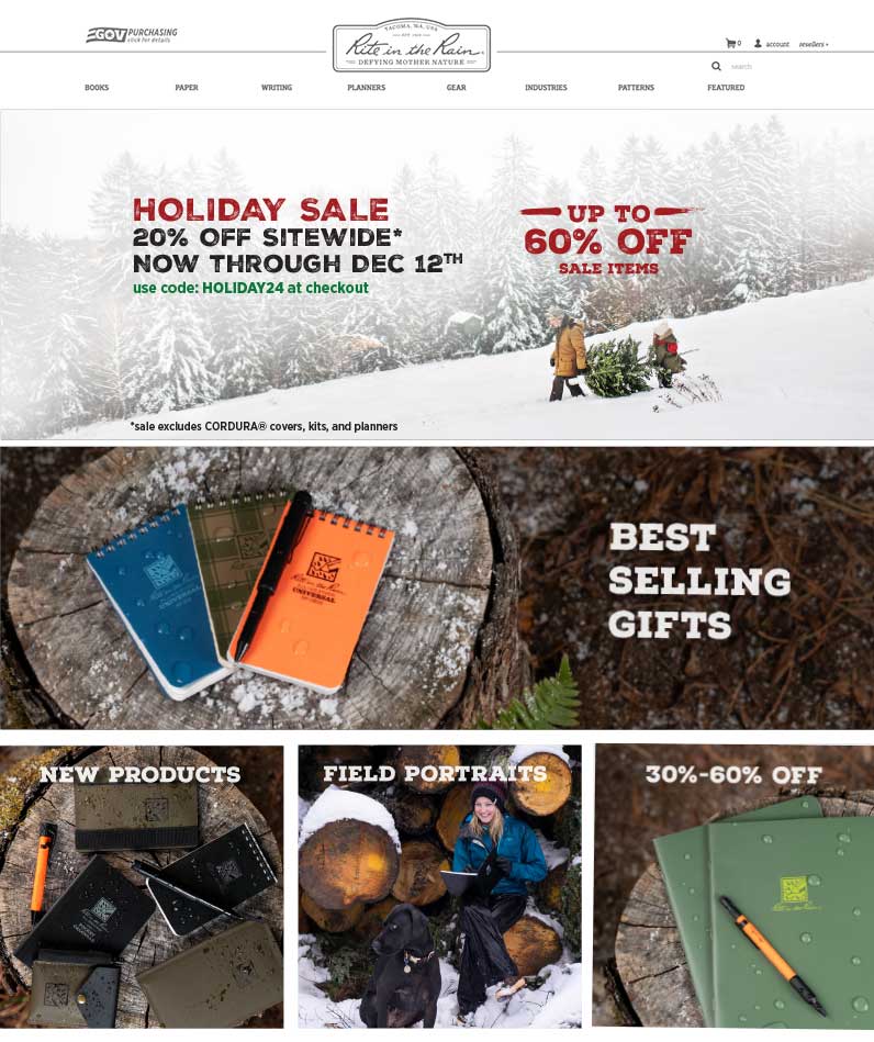
Homepage
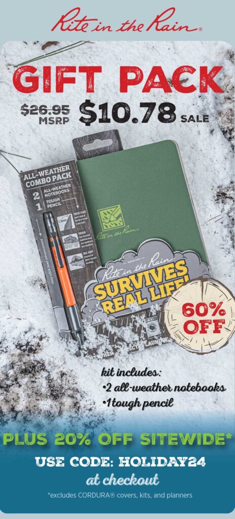
Holiday 360 campaign “Tree Rings of Life”. For this project, I led the brainstorm with the creative team, created a concept, art directed the photography, acted as lead designer for the homepage, subsequent landing pages, designed email template and emails (13 in total sent), social ads, and google ads.


